Project Details: Foyer & Powder Room | #ClientBigGrayHouse
We’re so excited to dive into the details from our #ClientBigGrayHouse project. This 1800s mansion on Columbia Square underwent a major renovation in 2015 (read more about the history of the home here) and was purchased by our client in 2016.
The accomplished wildlife photographer sought to make the home more inviting and functional while retaining the historic charm of its stunning architecture. We’ll be unveiling more about our redesign of the corner row house over the coming weeks.
First up: the foyer and downstairs powder room.
The Foyer
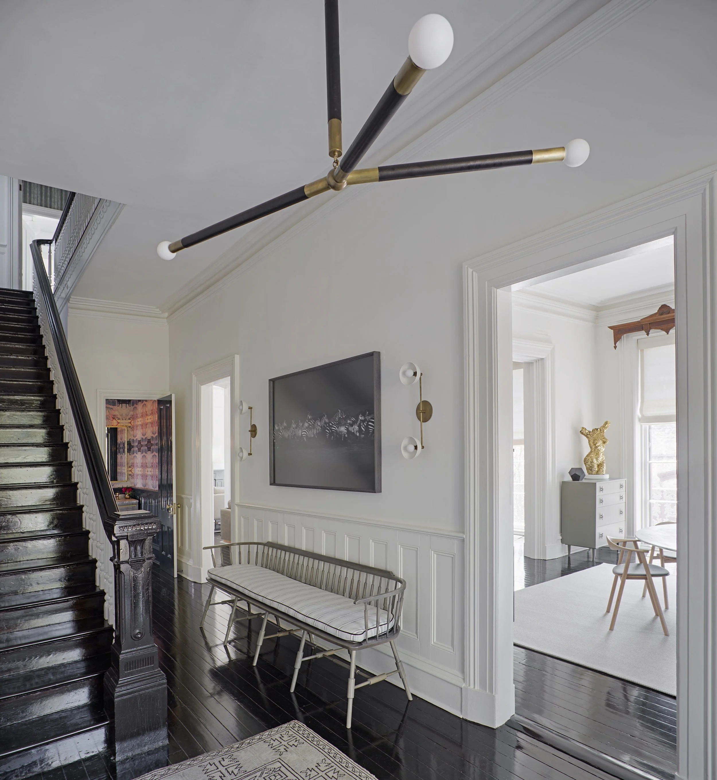
Our client really wanted an inviting space where friends and family could gather downstairs, so one of the first things we did was make the entryway more inviting. The foyer of this striking row house has high ceilings and gorgeous architectural elements that are original to the home. We wanted to showcase these details by incorporating a simple, but modern, design update.
We maintained the bright white paint throughout — from walls to trim to ceiling — to keep the area open and allow the architectural details to pop. We added an element of drama by hanging an oversized light fixture wrapped in calfskin and brass from Apparatus Studio. An American-made Windsor settee from O&G Studio was placed along the wall to highlight the wainscoting and draw the eye upward, where two brass and porcelain fixtures flank some of our client’s original photography.
And to handle the heavy foot traffic of the entryway, we placed a vintage Oushak rug along the walkway, that truly wears beautifully over time. In addition to adding some texture to the space, it also draws visitors in toward the real star of the first floor — the powder room.
The Powder Room
This small parlor bathroom is easily one of our favorite rooms in the home because small spaces create wonderful opportunities to make a big impact with thoughtful and bold design choices.
And one of the boldest choices we made in this home was the walls of the powder room. We covered them with a beautiful kaleidoscopic grasscloth, from artist Lindsay Cowles, and available through Bradley. We chose grasscloth over a vinyl to balance the modern graphic pattern with a more classic, natural and textural material. We then painted the trim a complimentary dark navy gloss by Farrow & Ball (Blue No. 30 to be exact).
We designed and then personally refinished (see “How To” coming soon) a floating oak vanity to bring out the wood’s natural grain and give it a weathered, gray patina. We topped it with a marble sink and Waterworks fixtures that add an air of elegance and refinement. The brass rail detail was fabricated to perfectly follow the radius of the custom vanity.
The powder room is the first space in the home you really notice when you walk in (aside from the first impression of the foyer), and we wanted to make it count. So, we used the opportunity to create a space that felt polished but still made a big splash.
Can’t get enough of #ClientBigGrayHouse? Search the tag on Instagram for more images of this stunning historic mansion.


